

We tend to think of pink as playful. Cute. Maybe even a little unserious. But before Barbie, before millennial pink, before pastel Instagram walls — pink was power. In 18th-century France, pink wasn’t a trend. It was a statement. It shimmered in silk gowns at Versailles, glazed royal porcelain, and wrapped itself around one of the most influential women in Europe: Madame de Pompadour.
The Rococo era didn’t just use pink. It elevated it. It turned the color into a symbol of luxury, taste, and access — the kind you had to earn (or inherit). And once pink became a language of indulgence, it never really stopped speaking. Let’s go back to where it all began.
How Pompadour Pink Became Power
Long before Barbie. Long before Mamie Eisenhower’s inaugural gown. Long before millennial pink coated cafés and iPhones—Pink ruled Versailles.
In the mid-18th century, during the height of the Rococo era, pink transformed from decorative flourish into a symbol of pleasure, refinement, and power. It shimmered in silk gowns, bloomed across salon walls, glazed porcelain at royal factories, and glowed in candlelit rooms where politics and flirtation intertwined.
Under the influence of Madame de Pompadour — chief mistress and trusted confidante of King Louis XV — pink became more than a fashionable hue. It became a cultural statement. Rococo France did not invent pink. But it elevated it. It made pink aspirational — and in doing so, laid the foundation for every modern revival that treats the color as shorthand for luxury, indulgence, and aesthetic sophistication.

From Baroque Drama to Rococo Pleasure
To understand why pink flourished in 18th-century France, you have to understand what it replaced. The Baroque period favored grandeur and weight: deep crimsons, heavy golds, dramatic chiaroscuro. Its art and architecture emphasized religious intensity and political dominance. But by the early 1700s, tastes began to shift. The French court, particularly after the move from Versailles to more intimate Parisian residences, gravitated toward smaller rooms, curved forms, and lighter palettes.
Rococo was born from this shift — a style defined by movement, asymmetry, ornament, and softness. Pastels became the palette of choice: powder blue, pale green, buttercream — and above all, pink. These colors reflected light rather than absorbing it. They suggested intimacy rather than spectacle. They made rooms feel animated and alive.
Pink, especially, captured the mood of the era. It evoked roses, flushed cheeks, silk ribbons. It suggested romance without solemnity and sensuality without severity. Rococo culture was not built around moral gravity. It was built around pleasure. And pink embodied that philosophy perfectly.
Madame de Pompadour and the Branding of a Color
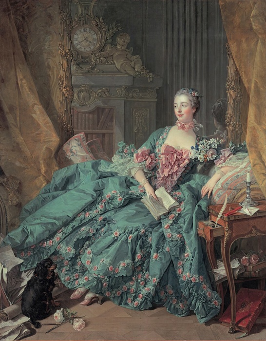
No figure shaped Rococo pink more decisively than Madame de Pompadour. Born Jeanne Antoinette Poisson, she rose from bourgeois origins to become one of the most powerful women in France. More than a royal mistress, she was an intellectual, art patron, and cultural strategist. She understood that image could shape influence. She favored pink — not subtly, but unmistakably.
Portraits by François Boucher depict her draped in voluminous rose silk, surrounded by books and flowers, enveloped in a world of blush upholstery and gilded scrollwork. The color flattered her complexion under candlelight, but it also projected refinement and cultivated taste. Her influence extended beyond the wardrobe. As a patron of the Sèvres porcelain manufactory, she helped popularize a specific pink glaze so distinctive it was named “Rose Pompadour.” This was branding before advertising.
The Economics of Pink: Luxury in Pigment
Color in the 18th century was not democratically available. It was expensive. Producing vibrant pink required access to costly dyes, including cochineal — a red pigment derived from insects harvested in the Americas and transported through colonial trade routes. Silk, too, was a luxury textile. Achieving luminous rose tones demanded skill, labor, and global supply chains.
To wear pink was to wear an empire. The shade signaled participation in wealth networks that stretched across oceans. It reflected both aesthetic taste and economic power. Pink shimmered because it was rare — and rarity created desirability. In Rococo France, color operated as currency. Owning pink silk, commissioning pink interiors, or collecting pink porcelain was not merely decorative. It was performative wealth.
Pink for Men: Ornament and Authority
One of the most overlooked truths about Rococo pink is that it was not gendered in the modern sense. Men at court wore rose-colored waistcoats, embroidered jackets, and silk stockings. Portraits show aristocratic gentlemen dressed in coral brocade and blush satin, powdered wigs perched above lace collars. Ornamentation was not seen as effeminate — it was a mark of rank.
Masculinity in the 18th century was theatrical. Status required display. Embroidery, color, and elaborate tailoring signaled proximity to power. Pink, as a softened extension of red, retained associations of vitality and authority. This aesthetic would not survive the coming century. The French Revolution and later industrial modernity would strip men’s fashion of ornament, ushering in darker suits and restrained palettes. Pink would gradually be relegated to femininity. But in Rococo France, pink belonged to anyone powerful enough to wear it.
View this post on Instagram
Living Inside Pink: Rococo Interiors
Rococo pink did not exist only in portraits. It shaped physical space. Salons — intimate gathering rooms designed for conversation and performance — were often washed in blush tones and framed with gilded moldings that curled like vines. Upholstered chairs carried floral pink accents. Porcelain figurines rested against rose-tinted walls. Even ceilings bloomed with mythological scenes painted in delicate pastels.
These interiors were immersive environments. Pink softened candlelight. It flattered skin tones. It harmonized with gold leaf and mirrored surfaces. It created a sensory cocoon that encouraged leisure and intellectual exchange. Luxury in Rococo France was experiential. It was about the atmosphere — how a room felt, how silk moved, how color glowed against skin. Pink wasn’t an accent. It was architecture.
When Pink Became Political: The Revolution’s Backlash
If Rococo pink symbolized pleasure, it also became a target. By the late 1780s, resentment toward aristocratic excess intensified. The French Revolution was not only a political upheaval — it was an aesthetic rejection. Ornamental interiors and pastel indulgence became shorthand for moral corruption.
Neoclassicism replaced Rococo curves. Straight lines, sober palettes, and Roman-inspired severity signaled civic virtue. Pink, once a symbol of cultivated taste, became associated with decadence. Luxury was suspect. The fall of Rococo aesthetics reveals an important truth: color carries ideology. Pink’s association with aristocratic pleasure made it vulnerable to critique. It wasn’t neutral; it was symbolic. Yet even as regimes collapsed, cultural memory endured.
View this post on Instagram
From Versailles to the Runway
Centuries later, Rococo pink continues to resurface in pop culture. Sofia Coppola’s 2006 film Marie Antoinette revived powdered wigs and confectionary palettes for a new generation, pairing pastel gowns with modern music. The film reframed Rococo indulgence as visually intoxicating rather than morally suspect.
Fashion houses repeatedly revisit 18th-century silhouettes and shades. Voluminous ruffles, corsetry, and blush satin appear on runways with deliberate historical echoes. Valentino’s 2022 “Pink PP” collection drenched couture in unapologetic monochrome pink — theatrical, immersive, and attention-commanding. Even the recent “Barbiecore” trend draws from Rococo logic: exaggerated femininity, ornamental silhouettes, and saturated pink as spectacle.
Meanwhile, millennial pink softened the hue for digital spaces — boutique hotels, startup branding, curated Instagram feeds. Its muted tone carried irony, but it also carried aspiration. The through-line is unmistakable. Rococo made pink luxurious. Modern culture keeps reinventing that luxury.
The Democratization of a Royal Shade
What began as an aristocratic display eventually became accessible. Industrial dye production in the 19th century lowered the cost of color. Textile manufacturing expanded. By the 20th century, pink appeared in suburban bathrooms, fashion collections, cosmetics packaging, and mass-produced interiors. The shade migrated from palace to middle class.
This transformation did not erase its origins — it diluted exclusivity while preserving association. Pink retained a whisper of indulgence, even when mass-produced. It still suggested softness, romance, or elevated taste. Luxury does not disappear when democratized. It adapts. Pink’s journey from Pompadour’s salons to global pop culture reveals how aesthetic language evolves.
View this post on Instagram
A Color That Refuses to Stay Small
Walk through Versailles today and you’ll still find rooms brushed in delicate rose. Tourists replace courtiers, but the palette persists. It whispers of an era when beauty was political and pleasure was performance. Pompadour Pink was never simply pretty. It proved that softness could command attention. That ornament could shape identity. That luxury could be immersive rather than austere.
Modern revivals — from couture to Barbiecore — are not accidents. They are returned. Every time pink dominates a runway or floods social media, it echoes Rococo logic: excess can be intoxicating. Beauty can be a strategy. The Rococo era did more than popularize a shade. It transformed pink into a visual language of indulgence and aspiration — one that continues to circulate centuries later. Pink no longer belongs to royalty.
Conclusion
Before pink was playful, it was powerful. In Rococo France, it wasn’t background decoration — it shaped rooms, framed influence, and signaled status. Under Madame de Pompadour, pink proved that softness could command attention and luxury could feel immersive. That’s why it keeps coming back. On runways. In pop culture. In design trends that lean into warmth during uncertain times. Pink resurfaces whenever we want indulgence without severity — presence without aggression.